
News
ICAN has a New Look!
- Detalles
- Categoría: News News
![]() Thanks to the wonderful talents of Amy Dozier, Research Assistant at MaREI Centre, University College Cork, ICAN has both an updated logo and color scheme, and the new look has been applied throughout the web site at: https://ican.iode.org. Thank you Amy!
Thanks to the wonderful talents of Amy Dozier, Research Assistant at MaREI Centre, University College Cork, ICAN has both an updated logo and color scheme, and the new look has been applied throughout the web site at: https://ican.iode.org. Thank you Amy!
To celebrate the new look, we’ve also moved a wealth of articles from the Newsletter archives onto the website, and we are working on linking these to the searchable directory of Atlases that is currently in progress.
If you have an old ICAN logo on your Atlas, we appreciate the support, and are ready to supply updated versions depending on your needs. Both horizontal and vertical versions are available, as well as a version that works side-by-side with the IDOE logo. The two most common versions are available at:
https://ican.iode.org/download/ican_member_logos.zip
Please let us know if you need other versions or sizes!
ICAN Tweets @ICANAtlas
- Detalles
- Categoría: News News
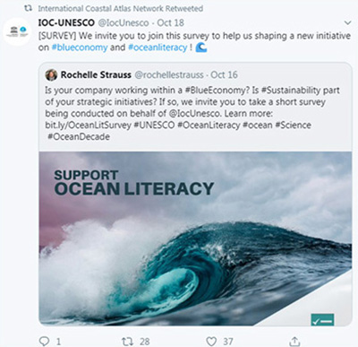
![]() ICAN is active on Twitter since August 2018 and has since gained 337 followers and while activity on social media varies and strongly relates to ICAN members taking part in events; ICAN gains on average 20 new followers and receives about 44 profile visits per month. The account reaches on average 4115 monthly tweet impressions, which refers to the number of times a tweet shows up in a twitter users timeline.
ICAN is active on Twitter since August 2018 and has since gained 337 followers and while activity on social media varies and strongly relates to ICAN members taking part in events; ICAN gains on average 20 new followers and receives about 44 profile visits per month. The account reaches on average 4115 monthly tweet impressions, which refers to the number of times a tweet shows up in a twitter users timeline.
 Themes
Numerous ICAN tweets to date are relevant to the UN Decade of Ocean Science and support associated dissemination of information and engagement with relevant topics. ICAN twitter audiences are gender balanced with 59% of the ICAN audience identifying as female according to Twitter analytics from June 2019.
Engagement
In May 2019, in support of the 1st Global Planning Meeting of the UN Decade of Ocean Science for Sustainable Development in Copenhagen ICAN generated 20 organic tweets with 17 specifically using the hashtag #OceanScience or #OceanDecade to encourage and disseminate event specific information in addition to relevant retweets from event participants that use twitter. ICAN in that month reached nearly 8000 tweet impressions, which refers to the number of times a tweet shows up in a twitter users timeline. In return the networks twitter account received 100 profile visits demonstrating interest of attendees in finding out more about the network.
Next Steps
ICAN commits to the continued retweeting of relevant content related to the Decade as well as tweeting original content accompanied by Decade Tags where appropriate.
 Follow us @ICANAtlas
University of Wisconsin initiates two phase study of coastal web atlases
- Detalles
- Categoría: News News
David Hart
Esta dirección de correo electrónico está siendo protegida contra los robots de spam. Necesita tener JavaScript habilitado para poder verlo.
![]() The University of Wisconsin’s Wisconsin Sea Grant Institute and the Cartography Lab at the University of Wisconsin-Madison are conducting a two-phase evaluation to identify best practices and future directions for the design and use of coastal web atlases. Preliminary results of this research will be presented at the Social Coast Forum in Charleston, South Carolina in February 2020.
The University of Wisconsin’s Wisconsin Sea Grant Institute and the Cartography Lab at the University of Wisconsin-Madison are conducting a two-phase evaluation to identify best practices and future directions for the design and use of coastal web atlases. Preliminary results of this research will be presented at the Social Coast Forum in Charleston, South Carolina in February 2020.
Phase I
The first phase involves a comparative analysis of coastal web atlases in the United States Atlases from Indiana, Maryland, New Jersey, New York, Ohio, Oregon, Texas, Virginia, Washington and Wisconsin will be reviewed by their interface design, usability, map representations and data services. The analysis is organized by the broad categories of maps, tools, catalog and learning resources, where:
- Maps are defined as: “Web maps which allow users to view coastal topics as presentational items and lack advanced analysis through exploration.”
- Tools are defined as: “Web maps and other tools which have advanced analysis and/or exploration features to guide decisions about coastal management.”
- Catalogs are defined as “Collections of data and/or media which is often accessed through an exploratory interface.”
- Learning resources are defined as: “Mostly textual information and/or story maps about a particular coastal topic which aim to educate the user on the topic.”
The only maps, tools, catalogs and learning resources included for review are those linked from the home page or other affiliated pages of the state coastal web atlases.
Phase II
The second phase is a survey that will be sent to representative users of the same 10 state coastal web atlases beginning in November 2019. The survey will track the same four broad categories of the comparative analysis (maps, tools, catalog and learning resources) and will ask questions about user experiences, values, and opinions regarding these resources.
Insights from both the comparative analysis and user survey will be used to improve the design of the Wisconsin Coastal Atlas. Results should be relevant to developers of other coastal web atlases and could be used more broadly to guide the design and use of geospatial information and maps for coastal management. For more information about this study, contact David Hart with Wisconsin Sea Grant at Esta dirección de correo electrónico está siendo protegida contra los robots de spam. Necesita tener JavaScript habilitado para poder verlo..
Resources
- Cartography Lab at the University of Wisconsin-Madison: https://geography.wisc.edu/cartography/
- Sea Grant, University of Wisconsin: https://www.seagrant.wisc.edu/
New York State Gateway Survey Results Summary
- Detalles
- Categoría: News News
Jeff Herter
Esta dirección de correo electrónico está siendo protegida contra los robots de spam. Necesita tener JavaScript habilitado para poder verlo.
New Yorkers rely on the New York Department of State Office of Planning, Development and Community Infrastructure’s Geographic Information Gateway (Gateway) every day to answer important questions. The Gateway provides answers to questions on habitats and environments, specific regulatory boundaries, coastal risk areas, and planning changes to local communities. All programs within the Office use the Gateway in their day to day operations from locating projects in relation to the State’s Coastal Area Boundary and significant coastal fish and wildlife habitat areas by Consistency staff to Brownfield Opportunity and Downtown Revitalization Initiative areas and Local Waterfront Revitalization planning efforts.The federally mandated Coastal Atlas is built on the Gateway and is used by homeowners and marine contractors alike as they prepare project submissions for consistency review. For those in local government or sister state agencies, the Gateway facilitates important decision-making by presenting relevant jurisdictional boundaries, providing information on grants possibilities, delineating areas of significant coastal fish and wildlife habitat, and illustrating climate change issues.
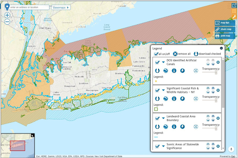
Figure 1: Example of a Coastal Map of Long Island, NY from the Gateway
 Survey
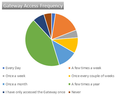
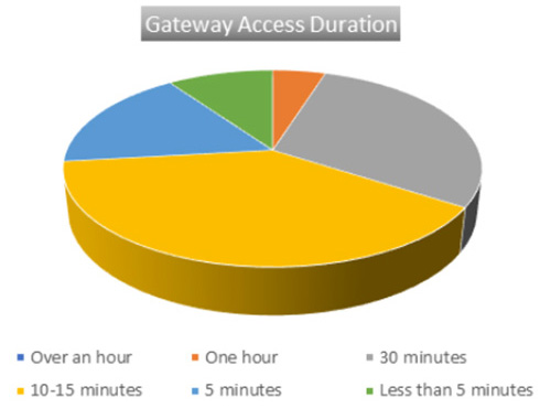
In September the Gateway team developed and conducted a short survey to get a sense of who is using the Gateway and glean some stories about how they are using it. Here is some of what we found out: 68 % of respondents worked for state government and 12% for local governments, counties, cities, towns and villages. Non-governmental organizations and those identifying as academic users each represented 5% of respondents and the general public only made up for 2%. This result really helped us understand that we had some real outreach work to do with regard to our target audience, local government and the general public. Users showed pretty broad interest regionally, with two data areas really standing out Great Lakes and Local Waterfront Revitalization Program data. All other data areas, Atlantic Ocean, Long Island Sound, Long Island South Shore Estuary Reserve and the Mohawk River Watershed had at least 25% of respondents showing interest. Over 1/3rd of respondents use the Gateway between 1 – 10 times a month and 41% use it a few times a year. And a few more numbers: Over half of the respondents feel the Gateway provides an easy intuitive experience; 61% said they would recommend the Gateway to their peers and co-workers; over 2/3rds, 68%, felt the Gateway provides information specific to their geographic area of interest, and finally, the average of respondents value for the Gateway was about $4000 per year (it’s free and will stay that way!)
Stories
Some of the stories we heard about how folks are using the Gateway:
- The Gateway is being used to access the New York Department of State risk areas for resilience planning and by State contractors and Lake Ontario communities engaged in the Lake Ontario Resiliency and Economic Development Initiative (REDI) through a REDI Mapper.
- Agencies and stakeholders involved in the Governor’s Office’s Environmental Justice and Just Change Working Group use a saved bookmark of the Gateway viewer to visualize potential Environmental Justice indicators.
- Educators and academics use the Gateway regularly as an in-depth learning opportunity and endless data source for a variety of topics, from high school geology students learning about deep-sea bathymetry to graduate-level marine biology researchers investigating fish and bird migration patterns.
- We heard from one private sector user, who provides software to State election boards, that relies on the Gateway for resolving redistricting disputes and would have to pay a corporate entity for data if the Gateway was not available.
- Other private sector businesses have told us that the Gateway offers an invaluable tool for revealing coastal zone management reviews, performing GIS analysis for clients, and providing mapping reference for geocoding projects.
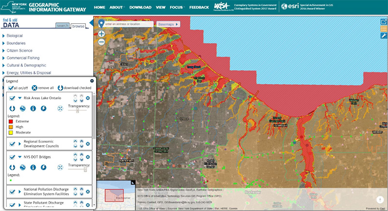
Figure 2: Example from Resiliency and Economic Development Initiative (REDI) mapper for Lake Ontario near Rochester, NY
Across the state, individuals access the Gateway when their need for information cannot wait. The Gateway’s availability as a real-time resource for latest conditions on tides, currents and recreational hotspots is integral to decision making for hundreds of visitors, from New York and all over the world. The Gateway’s “Story-Mapping” feature facilitates engagement with the Atlantic Ocean and climate change topics, providing stories of resilience and mitigation and highlighting the important work of the DOS Office of Planning and Development.
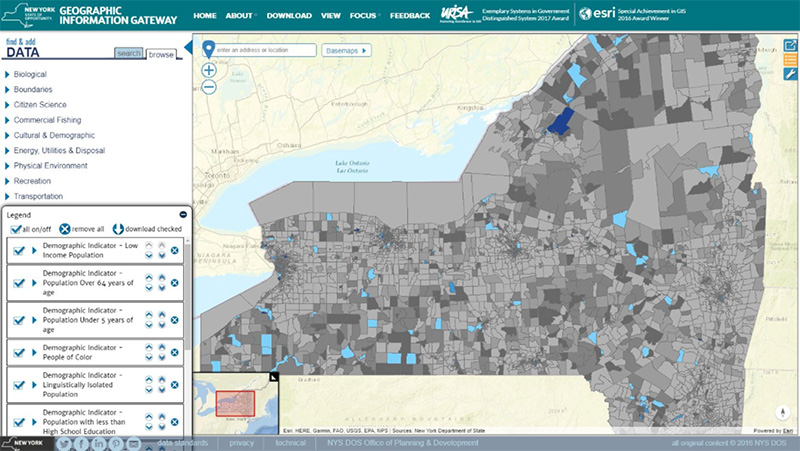
Figure 3: Example from the Environmental Justice visualization
The latest iteration of the Gateway has been met with consistent praise. The experience of browsing today’s Gateway is easy and intuitive, a unique feature for a deeply data-rich interface. The value of this ease of use cannot be understated, as a tool that is highly effective but difficult to use for much of its audience becomes immaterial. As the Gateway improves and grows, it continues to replace older and less engaging data sources, builds on ease of use and expands functionality. The Gateway is a platform for all New Yorkers and beyond, from every corner of the state, every professional sector and every background.
Traffic
Over the past 4 years we’ve had visitors from 105 countries outside the U.S., 54% of the countries in the world today. All 50 states and 3 U.S. territories have visited the Gateway and on average we get visits from 28 states outside of New York and 14 countries every month. The Gateway has exceeded 60,000 unique visitors since its launch. There have been over a quarter million pageviews, over three quarters of a million actions, and over 300,000 minutes or 5100 hours spent on the Gateway. On average we receive over 1220 visits and just over 5300 pages views a month. As the Gateway grows and improves, it will become more and more integral to planning efforts, day to day work flows and information dissemination.
Resources
- Access the New York Geographic Information Gateway at http://opdgig.dos.ny.gov/index.html#/home
Examples of Atlases for UN Sustainable Development Goals
- Detalles
- Categoría: News News
Andy Sherin
Esta dirección de correo electrónico está siendo protegida contra los robots de spam. Necesita tener JavaScript habilitado para poder verlo.
Several on-line atlases have been developed that are relevant to the United Nations Sustainable Development Goals. Three are highlighted here. Please send examples of other SDG relevant atlases to Andy at Esta dirección de correo electrónico está siendo protegida contra los robots de spam. Necesita tener JavaScript habilitado para poder verlo. for future articles.
Protected Planet
SDG Goal 14.5
![]() SDG Goal 14.5 states “By 2020, conserve at least 10 percent of the coastal and marine areas, consistent with national and international law and based on the best available scientific information”.
SDG Goal 14.5 states “By 2020, conserve at least 10 percent of the coastal and marine areas, consistent with national and international law and based on the best available scientific information”.
Learn more about SDG 14 here
Protected Planet is a publically available online platform where users can discover terrestrial and marine protected areas, access related statistics and download data from the World Database on Protected Areas. It is updated monthly and is managed by the United Nations Environment World Conservation Monitoring Centre with support from IUCN and its World Commission on Protected Areas.
Protected Planet provides data in several formats, supports an API and an ESRI Map Service.
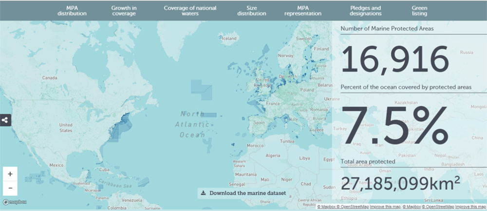
Figure 1: Sample map showing marine protected areas and statistics from the protectedplanet.net website
World Bank Atlas of Sustainable Development Goals
SDG Goal 14.3
![]() SDG Goal 14.3 states “Minimize and address the impacts of ocean acidification including through enhanced scientific cooperation at all levels”
SDG Goal 14.3 states “Minimize and address the impacts of ocean acidification including through enhanced scientific cooperation at all levels”
Learn more about SDG 14 here
The 2018 World Bank Atlas of Sustainable Development Goals has over 180 maps and charts showing the progress societies are making towards the 17 SDGs. The Atlas has annotated data visualizations, which can be reproducibly built form source code and data. The Atlas can be viewed online, download the PDF publication, and access the data and source code behind the figures.
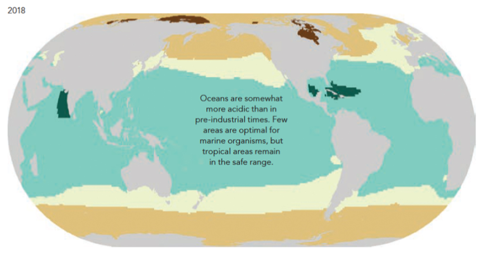
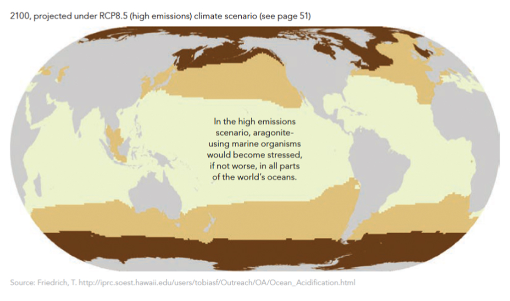
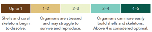
Figure 2: Maps of the impact of ocean acidification on organisms in 2018 and projected for 2100
in a high emission scenario from the 2018 World Bank Atlas of Sustainable Development Goals
Canadian Climate Atlas
SDG Goal 13.1
![]() SDG Goal 13.1 states “Strengthen resilience and adaptive capacity to climate related hazards and natural disasters in all countries”.
SDG Goal 13.1 states “Strengthen resilience and adaptive capacity to climate related hazards and natural disasters in all countries”.
Learn more about SDG 13 here
Environment and Climate Change Canada has released the climateatlas.ca that allows the user to interactively compare present conditions to future conditions for several significant climate parameters. The atlas doesn`t yet show ocean related parameters. Hopefully that will change in the near future. Shown in Figure 3 are two maps showing the present day frequency of very hot days (> 30 ° ) in Canada compared to predictions for the period 2051-2080 for a high GHG emissions scenario.
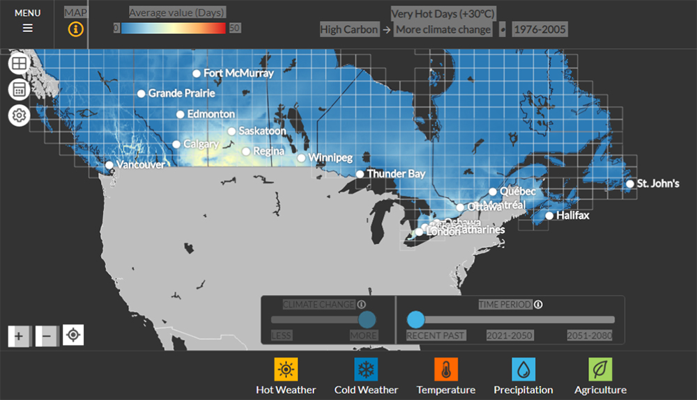
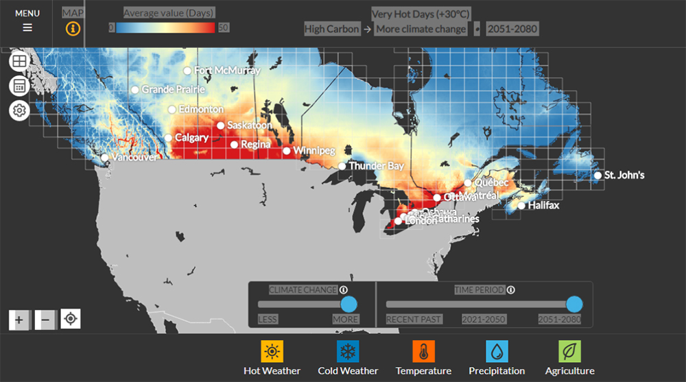
Figure3: Example map from Canada’s Climate Atlas website showing predicted differences between present day frequency of very hot days (top) and the frequency of very hot days in the period 2051-2080 assuming a high GHG emission scenario